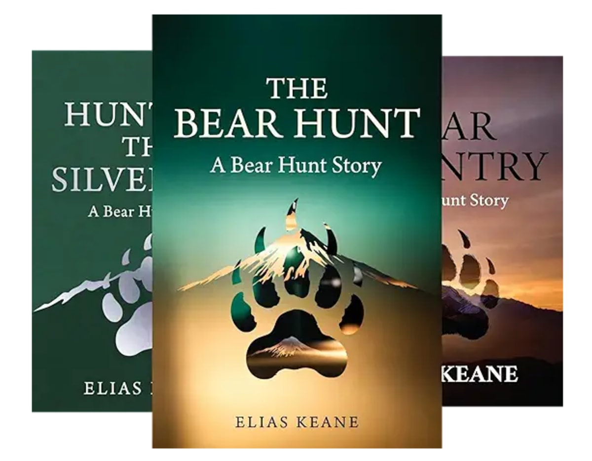
I ran a design contest for the new Bear Hunt Story covers. Seven hundred and eight people entered.
I want to tell you what happened, because somewhere around entry four hundred I stopped looking at book covers and started looking at something else. A kind of collective answer to a question I hadn't asked out loud. And the answer was wrong in a way I found genuinely interesting.
The brief
Five books. A contemporary M/M romance series set in the Cascades. Two men who fall in love in their forties, one of them a hunting guide built like a linebacker with a thick red-brown beard, the other leaner, taller, going silver at the temples. A cinnamon Chesapeake Bay retriever named Mabel. Snow, woodstoves, pine, firelight.
I thought I had been clear.
What came back
Slim young men. Over and over and over.
Not once or twice. Hundreds of times. Smooth-faced, narrow-shouldered, twenty-something silhouettes standing forehead to forehead against a lavender sky. Beautiful work, a lot of it. Skilled people making the thing they had made before.
By the third day I could predict the entry before I opened it. Two flat black figures. Pastel gradient behind them. Thin serif type. A tagline about finding your way home.
I want to be careful here, because this isn't a complaint about the designers. They were responsive, fast, and several of them turned out extraordinary work once we got into it. What they were doing was reasonable. They were giving me the visual language of romance as the market currently speaks it, and in that language, love happens to young thin people at golden hour.
Why it matters more than it sounds like it does
A cover isn't decoration. It's a contract.
It tells a reader, in about a second and a half, what kind of book this is and what kind of feeling they're going to get from it. Get it right and the right reader clicks. Get it wrong and two bad things happen at once. The reader who would have loved the book scrolls past it, and the reader who buys it based on the promise the cover made feels cheated when the book turns out to be something else.
So when a cover shows me two beautiful twenty-two-year-olds and the book is about a forty-one-year-old guide with a bad knee who hasn't let anyone into his house in eleven years, that's not a small mismatch. That's a one-star review with the word "misleading" in it.
Something I should explain about how these contests run: the entries were sealed. Designers submit privately and can't see each other's work. So when the same idea arrives forty times, nobody copied anybody. Forty people reached for it independently, which is a much more interesting fact than plagiarism would have been.
Two of those ideas came back so often I started counting.
The first was the ghosted second man. A solid figure in the foreground, looking away, with a translucent partner behind him, half there. Done well it's beautiful. It's also, unmistakably, the visual grammar of absence, the language publishers use for missing-person thrillers and novels about mourning. A reader scanning past it reads this man is haunted rather than these two found each other. Which is a strange thing to advertise for a series where the whole engine is two people building a life that works.
The second was pastel. Soft pinks and lilacs, silhouettes drifting through a snowy field, everything washed to the palest version of itself. Genuinely lovely, and it arrived over and over. It's also the visual signature of gentle small-town romance, tea shops, low angst, fade to black. My books are warmer than they are steamy, but they are not that. Pastel makes a promise about heat and weight that Bear Country does not keep.
The part I actually want to say
Here's what I kept circling back to, alone at the kitchen table at eleven at night with four hundred thumbnails open.
Nobody had drawn a body like the ones I was writing about.
Not one entry in the first several hundred showed a big man. A heavy man. A man with a belly and grey coming in at his temples and forearms that look like he uses them. The men in my books are bears in the way the word is actually used, which is to say they are large, hairy, often bearded, frequently past forty, and desired exactly as they are. That last part is the whole point. Not desired despite. Desired because.
And the field's collective instinct, four hundred times over, was to slim them down and take twenty years off them.
I don't think that was malice or even carelessness. I think it's what the training data of the culture says a romantic lead looks like. Ask for love and you get youth and thinness, because that association is so deep that it operates before anyone has time to think.
Which is precisely why I dug in about it.
There are readers who have spent their entire reading lives not seeing themselves on the front of a book. Men in their forties and fifties. Men who are big. Men who are grey. Men who have been told, in ten thousand small ways, that the love story is for other people and they can have the comic relief role or the sad supporting part. Putting Augie on a cover exactly as he is, broad and bearded and forty-one and being kissed, is a small thing. It costs nothing. It is also, for some reader out there, not nothing at all.
That's the book I wrote. It seemed worth insisting the cover said so.
Where it ended up
I cut the field to six, then to three. It took several rounds. The notes I was sending got very specific, and one of them read, in full: the grey-haired man is the taller one.
The three that are left have done something none of the first four hundred did. They drew two big bearded men in their forties, touching, looking at each other, in the snow and the firelight, and they made it look like exactly what it is.
I'll be putting those three in front of readers shortly and letting them pick. If you're on my list, you'll get a say. If you're not, that's the reason to be.
Yours, Elias